How to Make a Graph in Google Sheets
Step-by-step guide on creating and customizing a graph in Google Sheets. Includes tips, best practices, and common pitfalls to avoid.
- Open Google Sheets
- Open a Spreadsheet
- Input Data
- Select Data
- Insert Chart
- Choose Chart Type
- Customize the Chart
- Position the Chart
- Tips and Best Practices
- Common Pitfalls to Avoid
- External Resources
1. Open Google Sheets
Visit the Google Sheets website and sign in with your Google account.
2. Open a Spreadsheet
Click on a spreadsheet where you want to create the graph. If you haven't created one yet, click on the '+ Blank' button to create a new spreadsheet.
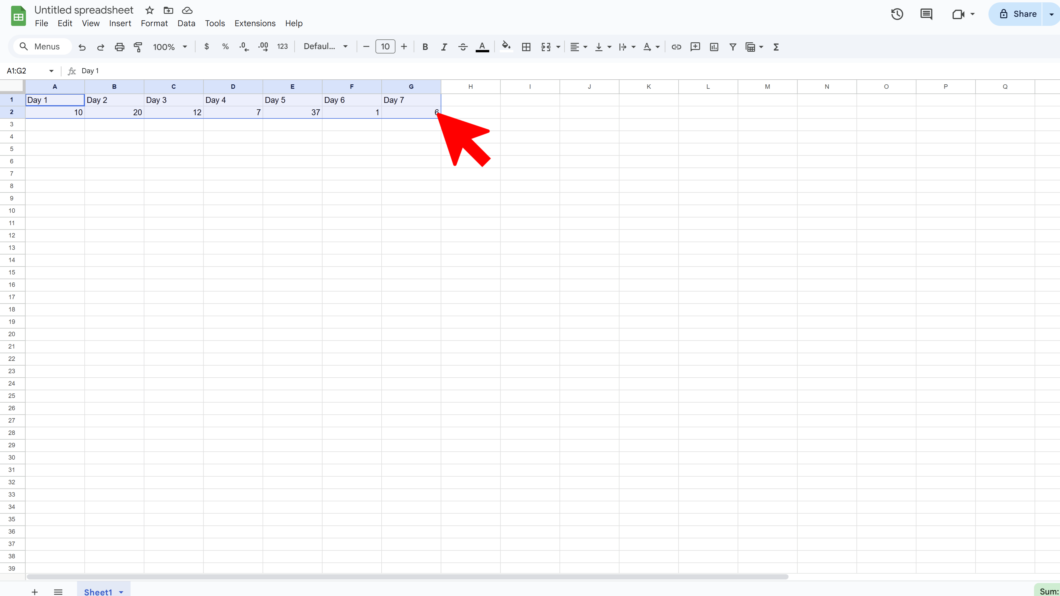
3. Input Data
Enter your data into the spreadsheet. A basic graph uses two columns or rows of data. One for the x-axis (horizontal) and one for the y-axis (vertical).
4. Select Data
Click and drag your mouse to highlight the data you want to use for your graph, including the column or row headers.
5. Insert Chart
Click on the 'Insert' menu at the top of the screen, then click on 'Chart'.

6. Choose Chart Type
A chart will appear in your sheet along with a sidebar on the right for chart editor. Here, you can choose the type of graph you want to create (e.g., line graph, bar graph, pie chart, etc.) under the 'Chart type' dropdown menu.
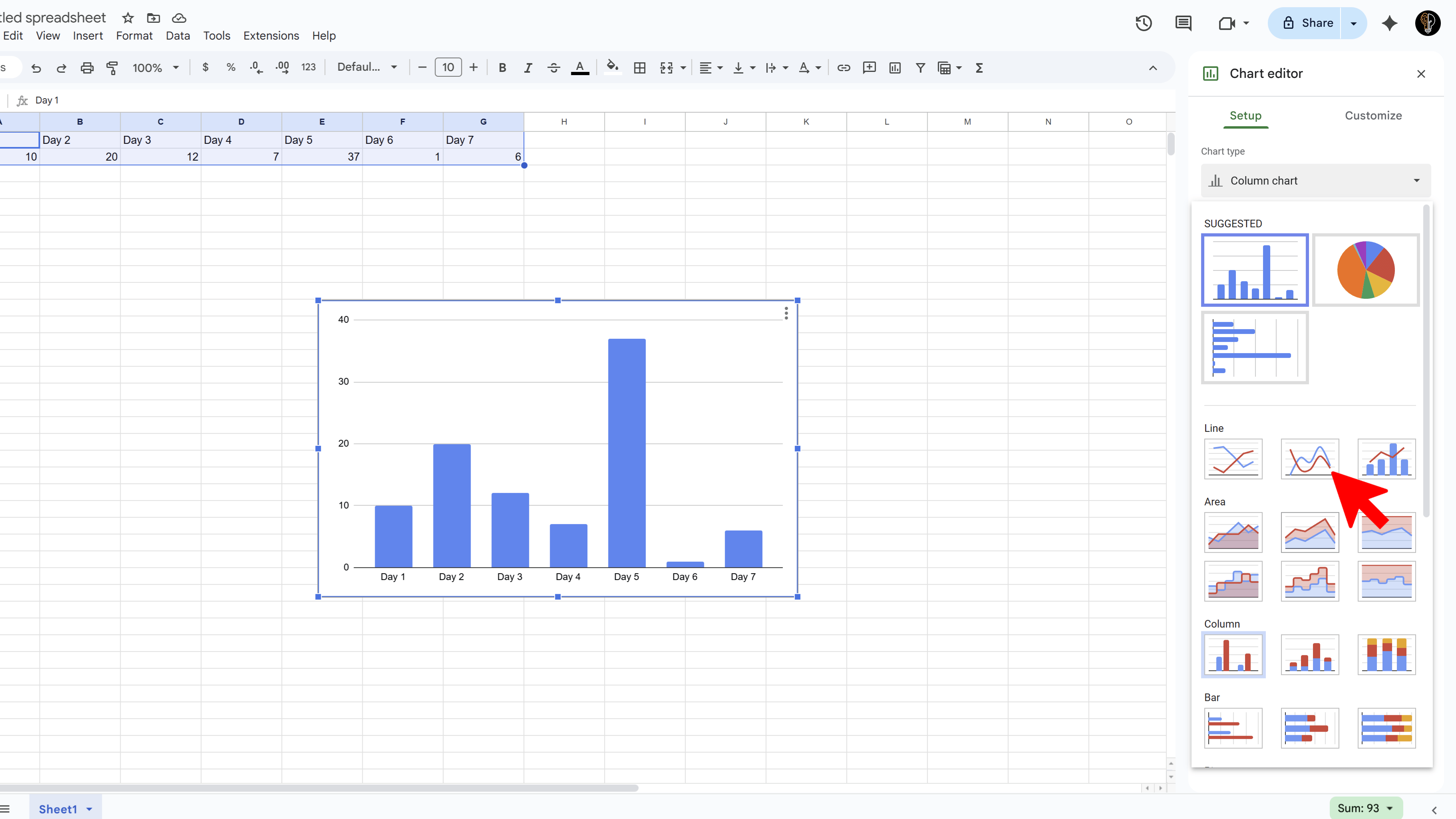
7. Customize the Chart
You can further customize your chart using the options under the 'Customize' tab in the chart editor sidebar. You can change the title, legend, font, colors, axis labels, etc.
8. Position the Chart
Click on the chart and drag it to where you want it on the spreadsheet. You can also resize it by clicking and dragging the corners.
Tips and Best Practices
- Always label your axes and provide a title for your graph to make it understandable.
- Remove gridlines for a cleaner look. You can do this under the 'Gridlines' option in the chart editor.
- Use contrasting colors to make your graph visually appealing and easy to understand.
Common Pitfalls to Avoid
- Avoid making the graph too complicated. Overloading it with data or unnecessary decorations can make it confusing.
- Make sure your data is accurate and up to date. Errors in your data will lead to errors in your graph.
External Resources
Examize: AI Quiz Maker
Create AI quiz questions for Google Forms in minutes. Generate, translate, and enhance quizzes with support for 70+ languages.
- AI-powered question generation
- Support for 70+ languages
- Multiple question types
- Generate from text, files, or URLs
- Auto-grading with feedback
- Built right into Google Forms